


BISHKEK, KYRGYZ REPUBLIC
Ant's Coffee
Redesign & Brand Identity
Ant's Coffee is a chain of urban coffee shops that approached us to design regular paper cups. After analyzing the tasks and existing branding, we've found that the chain doesn't have a unified style, and the existing logo does not reflect their character and atmosphere. The coffee shops didn't even have branding elements. We offered them new ideas, which could serve their actual purposes and simplify the design work in the future.


Some sections of the walls are covered in a pattern that the owner calls an "ant trail". We decided that this is a great element, the essence of which we can take as a basis, making a recognizable element for everyone. It's simple, blends well with the colors, is photogenic and is perfectly visible from afar. The line of the original wall cast was too thin and unsightly, so we decided to transform it into a more appropriate pattern by tripling the number of lines.
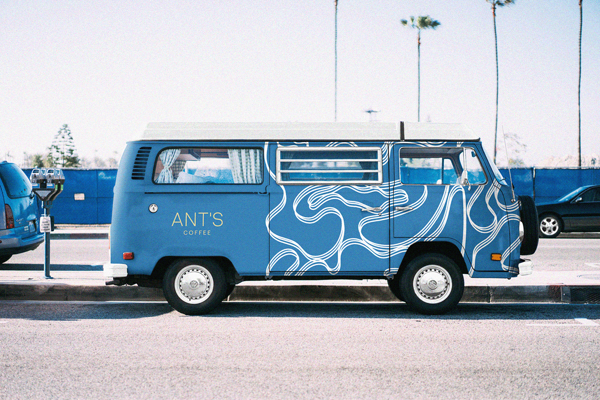
The work on the logo was different — the client asked to keep the writing in fine print. The old logo did not follow the rules of typography: the font was outdated, the lines were very thin, the kerning was missing completely. In addition, the logo had a sign — an ant. We suggested removing the ant, using it solely as part of the identity and correcting some unfortunate points for better scalability. In addition, we created a new font part from scratch.

Once we've approved the basics and got the right sign, as well as the elements of the identity, we can move forward on the ant trails, picking out the parts of daily coffee shop life we need.


Thank you for watching.


